
Interactive Map Shows Renters are More Cost-Burdened Than Homeowners Around the Country
Housing affordability is an issue that affects households across the US, yet varies by metropolitan region. Our 2019 State of the Nation’s Housing report includes an interactive map that highlights cost burdens in metros from coast to coast, showing how households fare, taking into consideration such factors as median housing costs and incomes.
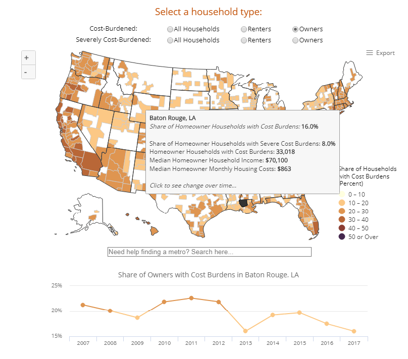
The interactive map displays the shares of those with cost burdens (households spending more than 30 percent of their income on housing costs) and severe burdens (households spending more than 50 percent of their income on housing costs). It also shows the number of households with cost burdens, median incomes, and median monthly housing costs for each metro. Additionally, when you click on a metro, the map populates a 10-year timeline of cost burden shares for each metro from 2007 through 2017, which allows users to observe the changes in cost burdens for all households, homeowners, and renters over time.
Renters in expensive coastal metros have some of the highest rates of cost burdens, as seen on the interactive map. Yet, renter households in regions with less expensive housing costs still maintain high cost burdens. For instance, 53 percent of renters in the Montgomery (AL) metro are cost-burdened with 35 percent suffering severe burdens. Renters in the Bloomington (IN) metro have cost burdens of 55 percent and severe burdens at 38 percent. Median monthly housing costs for renters in Montgomery and Bloomington are $860 and $850, respectively.
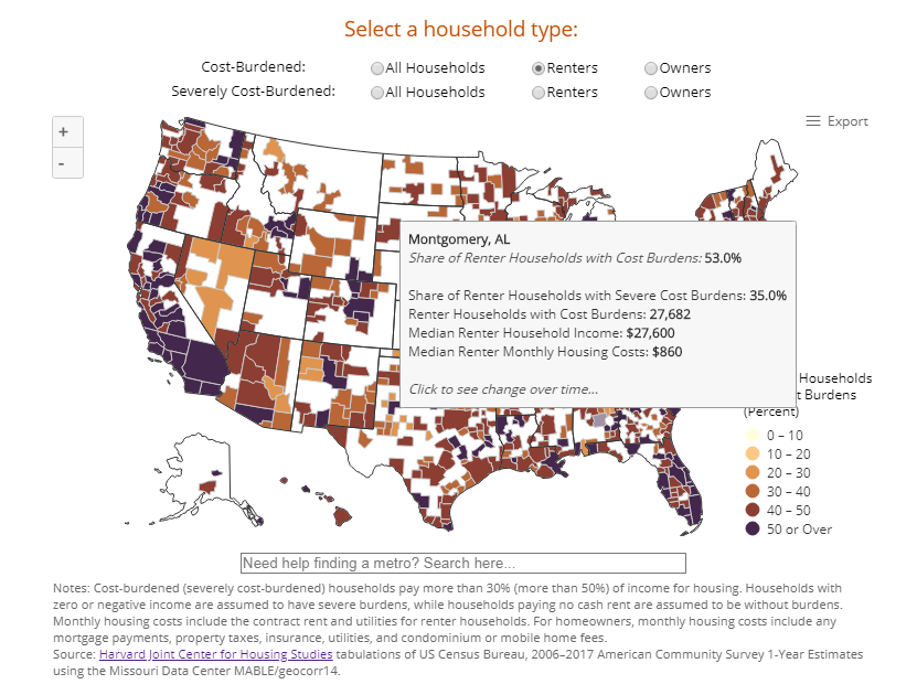
In these metros with relatively low rents, cost burden rates were higher than the US median of 47 percent even though median rents were lower than the US median of $1,010. This is because median incomes of renters in these metros, at $27,600 (Montgomery) and $24,000 (Bloomington), were even lower, relative to US median renter income of $38,300. These metros illustrate how housing affordability for renters is not limited to the west and east coasts but transcends state lines to the south and midwest.
Homeowners have lower cost burden rates than renter households nationally. This shift can be seen when using the map to compare homeowner vs. renter cost burdens. To look further into these changes over time, the timeline provided for each metro on the map allows the user to visualize the decrease in homeowner cost burdens over the past decade. Take, for example, the coastal metro of Los Angeles where homeowner cost burdens decreased from 45 percent in 2007 to 35 percent in 2017. Similarly, in 2007, 21 percent of homeowners were cost-burdened in Baton Rouge, a southern metro, declining to 16 percent in 2017.
The prevalence of housing cost burdens for owners and renters changes from region to region. The cost burden mapping tool is a platform offering a visual representation of affordability differences in metros around the country. Visit the interactive map to see measures of affordability in your area.